Pick a Side, Any Side
Let's search for clues in this choppy, directionless market. Plus, a look at the 'poster child' for this market, how the rest of the world is doing better than the U.S., Bitcoin, Trade Desk and more!
You've reached your free article limit
You've read 0 of 1 free Pro articles.
The Market
"Pick a side already! Come on Helene, I’m asking you to pick a side." That’s what my inbox looks like.
I picked a side on Thursday. I said I want to see us probe the highs, go over the highs and see what’s up there. And what did the market do? It went up and like a scared cat, turned right around and came right back down. I’d still love to see it try it, but thus far they haven’t been able to do it.
And still the indicators haven’t changed. In fact, we had worked off the short term overbought condition by midweek last week — thus my request to see what was over the old highs — but by midweek this week we’ll be right back to an overbought condition.
Here’s where we are: in a choppy market. Directionless. With no direction it is hard for the indicators to get any traction one way or the other.
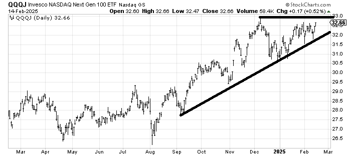
Did any of the charts we’ve been watching break? No they did not. Now maybe I need a list of charts to watch that might break out to the upside, although quite frankly there are so few groups that I could put in that category except for the indexes and the QQQs.
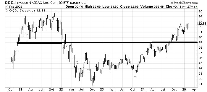
I have liked the Junior QQQs (they trade thinly but they give us a great idea of where the action is, which is smaller tech stocks, not mega ones). The chart of Invesco NASDAQ Next Gen 100 ETF QQQJ would be one to put on the watch list. That high at $33 from December has been acting as resistance. Can it break out now?
If we look at the weekly chart of QQQJ we can see that getting over $33 isn’t a serious breakout because there is resistance all the way up but at least we will be able to see if it is sustainable.
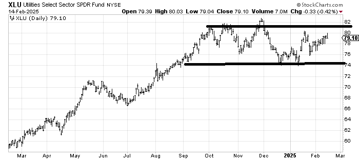
Or maybe we can watch the Utes. Utilities Select Sector SPDR Fund XLU has also been in a wide range since the fall. Bonds have taken out the mid-January high (low in rates) but the XLU got up there Friday and said, nope.
The one thing that has been constant this year is that much of the rest of the world — not all — is doing better than the U.S. Remember all those charts that we saw at year-end, and most of January, showing how the U.S. has led the world and all those rationalizations for why it would continue?
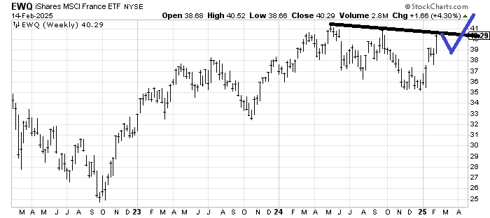
Back in late November, as our markets were topping I said look at iShares MSCI France ETF EWQ, an ETF to be long France. Framce was having all sorts of issues, new elections, no confidence votes, Europe slowing down, etc. Yet it looked to me as if this chart was a buy because it was no longer going down on bad news. I think we can all agree that the U.S. markets don’t look like that over the last six weeks, even though they are both kissing the old highs.
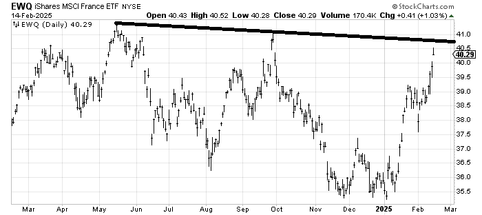
This looks over-extended now but take a look at the weekly chart as well. Imagine if it maps out as I have drawn in blue.
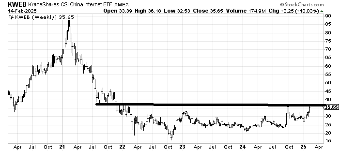
We’ve looked at KraneShares CSI China Internet ETF KWEB quite a bit recently as well, even again last week (with a positive eye). But look at this weekly chart. There is resistance at $40-45 from back in 2021 but get through that and folks will be loving on China again. Also look at the action since the calendar turned to 2025, which is a lot more UP than our sideways market.
I have no strong view on the week ahead. I am told it is seasonally weak but considering the put/call ratio was 0.70 on Friday and the folks in my weekend poll voted the next 100 points would be up, it seems to me most are looking for more up than down.
New Ideas
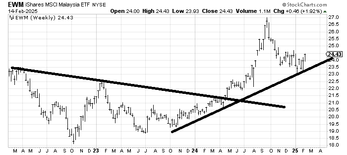
Last year in January I recommended iShares MSCI Malaysia EWM, an ETF to be long Malaysia. It had a terrific run through September. It has since had quite a correction and unlike many of the other non-U.S. charts we looked at above it hasn’t had a big run in 2025. I don’t have a strong view on the near term but that looks like a chart that is rounding under and as long as it stays over $23 is a good chart.
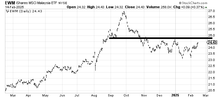
Here’s the weekly chart.
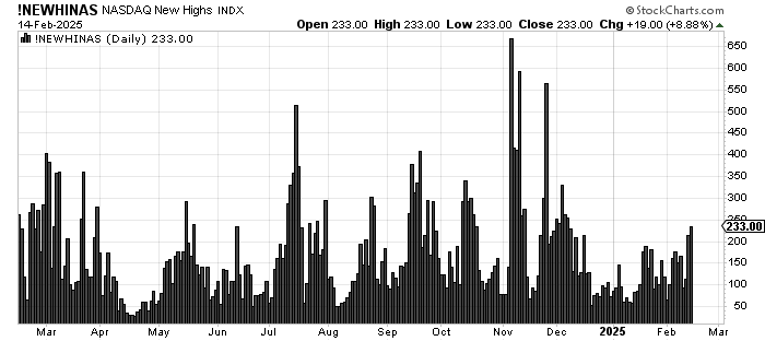
Today’s Indicator
The number of stocks making new highs is creeping up but far from impressive.
Q&A/Reader’s Feedback
Helene welcomes your questions about Top Stocks and her charting strategy and techniques. Please send an email directly to Helene with your questions. However, please remember that TheStreet.com Top Stocks is not intended to provide personalized investment advice. Email Helene here.
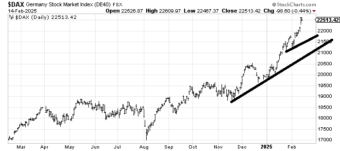
We may as well start with the DAX. It looks overextended to me but hasn’t done anything wrong. A pullback into that 21250-21500 area ought to find support.
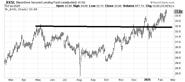
Blackstone Secured Lending Fund BXSL has a big juicy dividend and recently broke out. It measures to $35-ish.
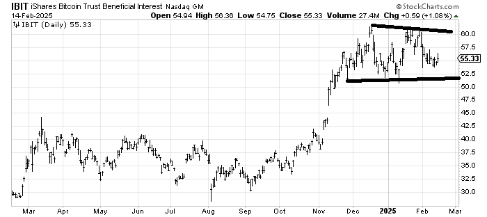
iShares Bitcoin Trust IBIT, an ETF to be long Bitcoin, hasn’t done a thing in months. I’m going to say it remains in a range of $50-60 and unless/until it breaks one way or the other, it’s a coin toss.
But speaking of coins being tossed. I did recommend Coinbase COIN last week. It had a great run up and then earnings took it right back down. Yet somehow I still think it rallies again. I feel more confident in that than IBIT. But COIN is the poster child for this market: run up and stop, fall down and stop.
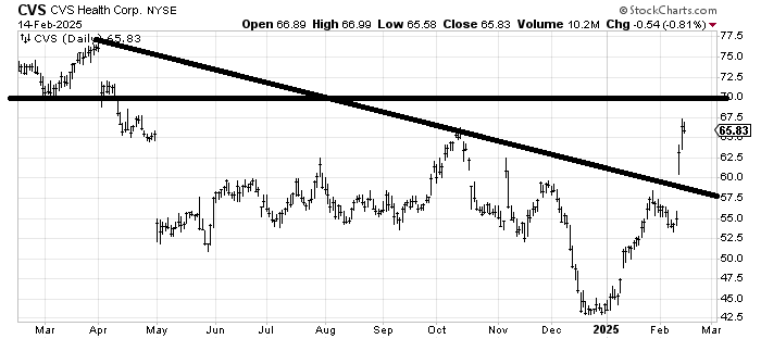
CVS CVS managed to jump over the downtrend line on earnings and ran right into resistance. A pullback toward that line would be a good shakeout. Longer term this ought to make its way toward $70-75 ($70 is resistance while $75 is a measured target).
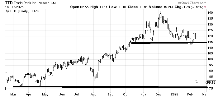
That breakdown in The Trade Desk TTD measured to $90 and it blew past it. There is support around $75-77 so I would expect a short-term bounce from there but that’s the best I see for now.
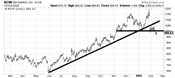
ServiceNow NOW is a tiny bit oversold down here. I would expect $1,000-ish to be resistance. And this is key: If it can recapture $1,000 readily and make its way to $1,050 then this breakdown looks false; if it can’t it ultimately measures to $850-ish.
For all who ask when a stock or index gets back to the old high, is that a double top? Keep this chart in mind. It is not a double top until it breaks the "valley" between the two peaks. This is a double top but I like to allow for false breakdowns. However, if it does turn out to be a double top, then the measurement is as above.
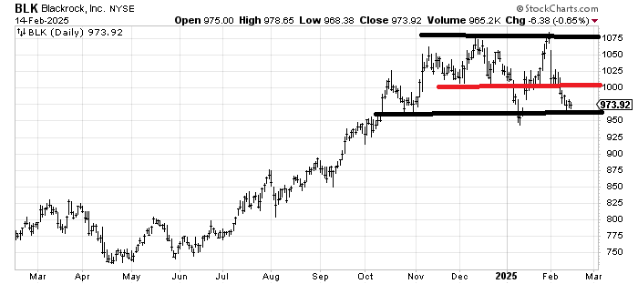
There is a lot going on with the chart of BlackRock BLK. It broke a solid uptrend line back in early January (not shown) and then snapped right back (you see why I like to allow for false breaks — in both directions!) but now it is retesting that gap and the prior lows. If you wanted to take a stab here then the risk/reward isn’t bad because under $950 and you’re wrong. However, there is now so much resistance all the way back up that you must watch $1,000 closely. Failure to get back over and the next time down it would be likely to break.
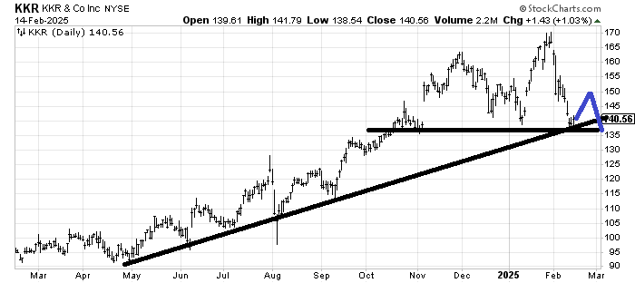
KKR KKR is a similar picture to BLK but this one has not broken the uptrend line even though it has made a lower low (than January). My best guess is it bounces from here and comes back down. My question is whether or not it breaks $135 on the next trip down. The blue lines are meant to show the pattern I expect, not the exact price levels. If it maps out like this it will look like a head-and-shoulders top.
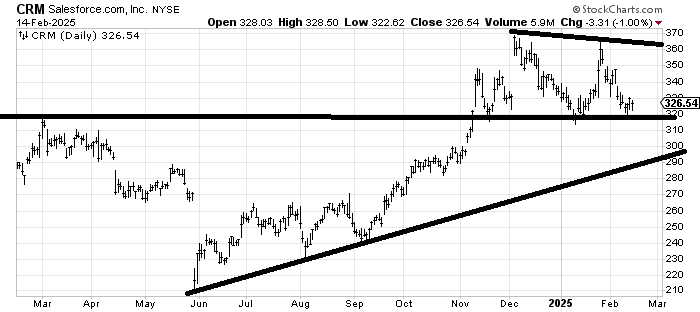
When we last looked at Salesforce CRM several weeks ago I drew (in blue) up, then down, then up. We got the up, we got the down, but so far the up has been worthless. If it breaks under $320 now I think it is going to tag that lower line. Earnings are next week.