Charting the S&P 500: What an 'Inverted Hammer' Might Mean for the Market
Let's discuss what the market's rejection of the highs may signal as well as the status of long-term uptrend.
You've reached your free article limit
You've read 0 of 1 free Pro articles.
At some point you have to believe the markets are going to pull back for a correction of medium size. With the bullish trend still working that drawdown probably represents another buying opportunity among the many we have seen since April. A series of higher highs, higher lows on the chart is our textbook definition of an uptrend, and without question the bulls are dominating the action.
The current pattern this past week shows what technicians call an "inverted hammer," where stocks open at the lows of the week, move higher but then retreat to close at those initial lows. It may signal exhaustion or buyers not interested in buying at higher prices, but as always we like to see a confirmation to see if the pattern plays out.
So, if last week's candle does not create a lower high and lower low, then we can just consider this another step in the long-term market uptrend. Let's color this a "yellow flag" alert. If there is downside then we could see some lower levels tested rather quickly.
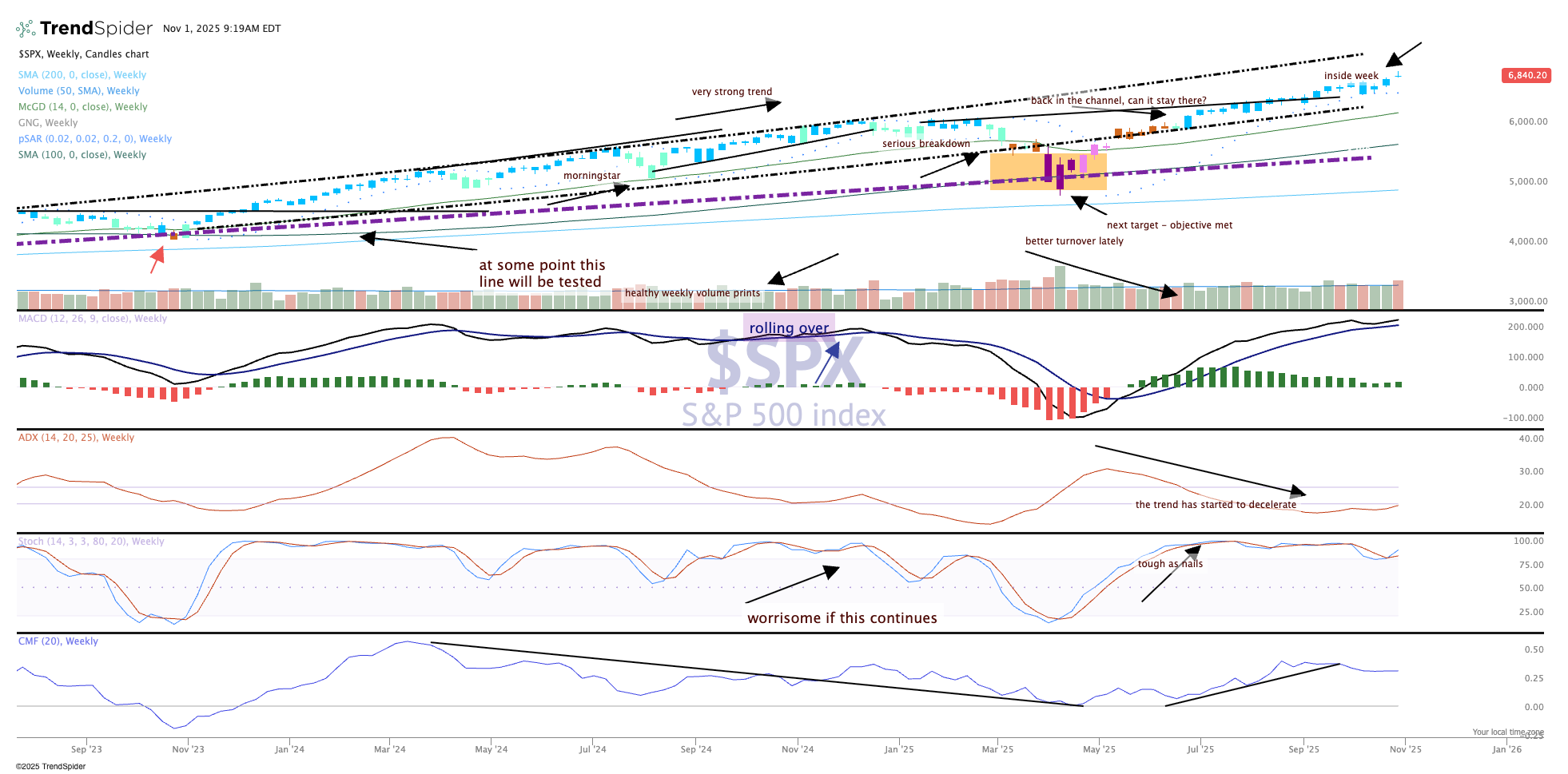
The concern, of course, is trying to predict with some certainty when a down move is going to happen. Unless you're Nostradamus, however, you're not going to accurately predict these moves with any regularity. The indicators are looking strong and remain supportive of the trend, so we'll just stick with those.
The candles remain blue, which is strongly bullish on the GoNoGo composite of indicators. The price remains in the upward-sloping channel and is working its way to the top of it. Nothing wrong with this pattern for the bulls.
