Why the S&P vs Nasdaq Ratio Could Signal a Market Turning Point in 2026
A closer look at the S&P/Nasdaq ratio reveals patterns that often precede major corrections. Here’s why this chart matters more than equal-weight comparisons.
You've reached your free article limit
You've read 0 of 1 free Pro articles.
As you can imagine, I spend a great deal of time staring at charts. I look at indicator charts, I look at individual stock charts, I look at ETFs, Indexes, Commodities, Bonds, and Currencies. I also like to look at ratio charts.
I realize everyone is quite excited over the prospect of the 493 having their day (year?) in the sun in 2026, and Friday’s action would have made folks even more excited. We’ve looked at the ratio of the RSP (equal weight) to the S&P (cap weight) with this same blue line drawn on it several times now. The one takeaway I have is that it’s been in a long-term downtrend without a higher high since last spring.
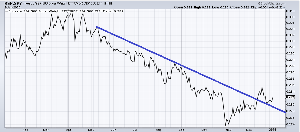
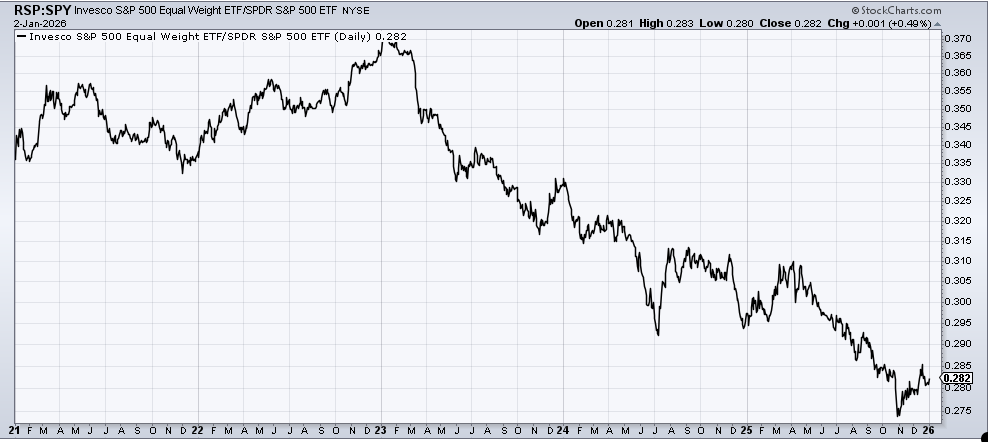
If we look at the five-year chart, we can see that this recent move up is just another in a long string of attempts since the calendar turned to 2023.
But I would ask that you keep an eye on the ratio of the S&P to Nasdaq. First of all, I know I am ancient because I still use the Nasdaq Composite and not the NDX (which I view as narrow), but do you see the way this ratio, while also in a downtrend since last spring, is on the cusp of a higher high—or at least much closer to getting there than the RSP/SPY ratio?
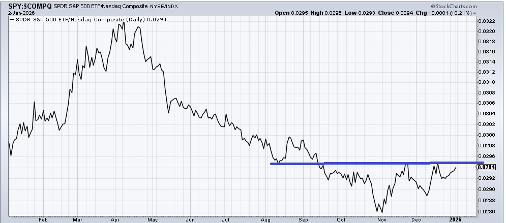
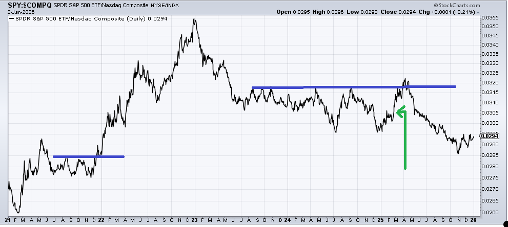
Notice that the longer-term chart of this relationship looks quite different than the equal-weight relative to the S&P. It has also tended to have a sharp rise prior to major corrections. I highlighted this chart exactly four years ago when it was on the verge of breaking out after an extended sideways move as we entered the year 2022 (far left side of the chart).
The green arrow shows you this time last year, well, actually February, as it enjoyed a sharp rise followed by a minor higher high in March, all well before the tariff news. My point here is that when the S&P outperforms Nasdaq the big-cap indexes tend to have sharp corrections. That is why I’d rather focus on this ratio than the equal weight one.
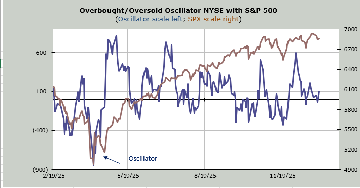
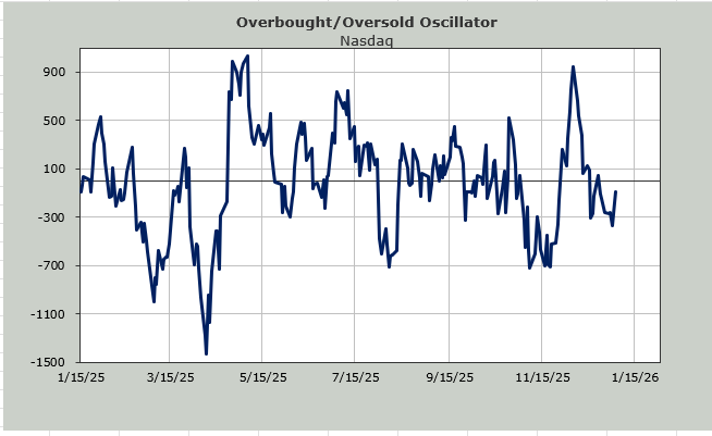
Now in the very short term, Nasdaq has just had five straight down days, something it hasn’t done since January last year (now there’s a change). Can it go to six or seven or more? Sure, but the same way five straight up days should have you thinking ‘pullback’, five straight down days should have you thinking ‘bounce’.
My Overbought/Oversold Oscillator for Nasdaq will be oversold within a few days. That’s why I’m going to watch that ratio chart of the S&P to Nasdaq because if it can’t make a higher then nothing has changed. If it can, then yes, there is a change underway.