These Three Charts Give a Sober Look at Trade Balances
Let's move away from the hype and take a close inspection of what's really going on with international trade, as we approach the one-year mark on tariffs.
You've reached your free article limit
You've read 0 of 1 free Pro articles.
My twitter “for you” stream was filled with three themes today:
- A dog who “stole” the Olympics but running with cross country skiers.
- Headline after headline about “most bullish” time ever claims for Bitcoin. Or, equivalently, some very high price targets (with $1 million not being uncommon). They were treating all of these claims as though somehow the “predictions” are new and interesting, but they all come from the same people who have been making those claims for years. Yawn. The price action despite widespread support for the industry from this admin, continues to scream “stay away for now” to me.
- That we had a 78% reduction in the trade deficit and a claim that it will go positive this year. I’ve been on the road, so it is quite possible I missed something. The amount of bickering in the comment section seemed insane, even by Twitter levels of insanity. That also attracted my attention.
But enough with the Tweets. Let's get to the data.
Some Long Term Trends
Let’s start by taking a long-term look. Check out this chart of the U.S. trade balance of goods over the past decades:
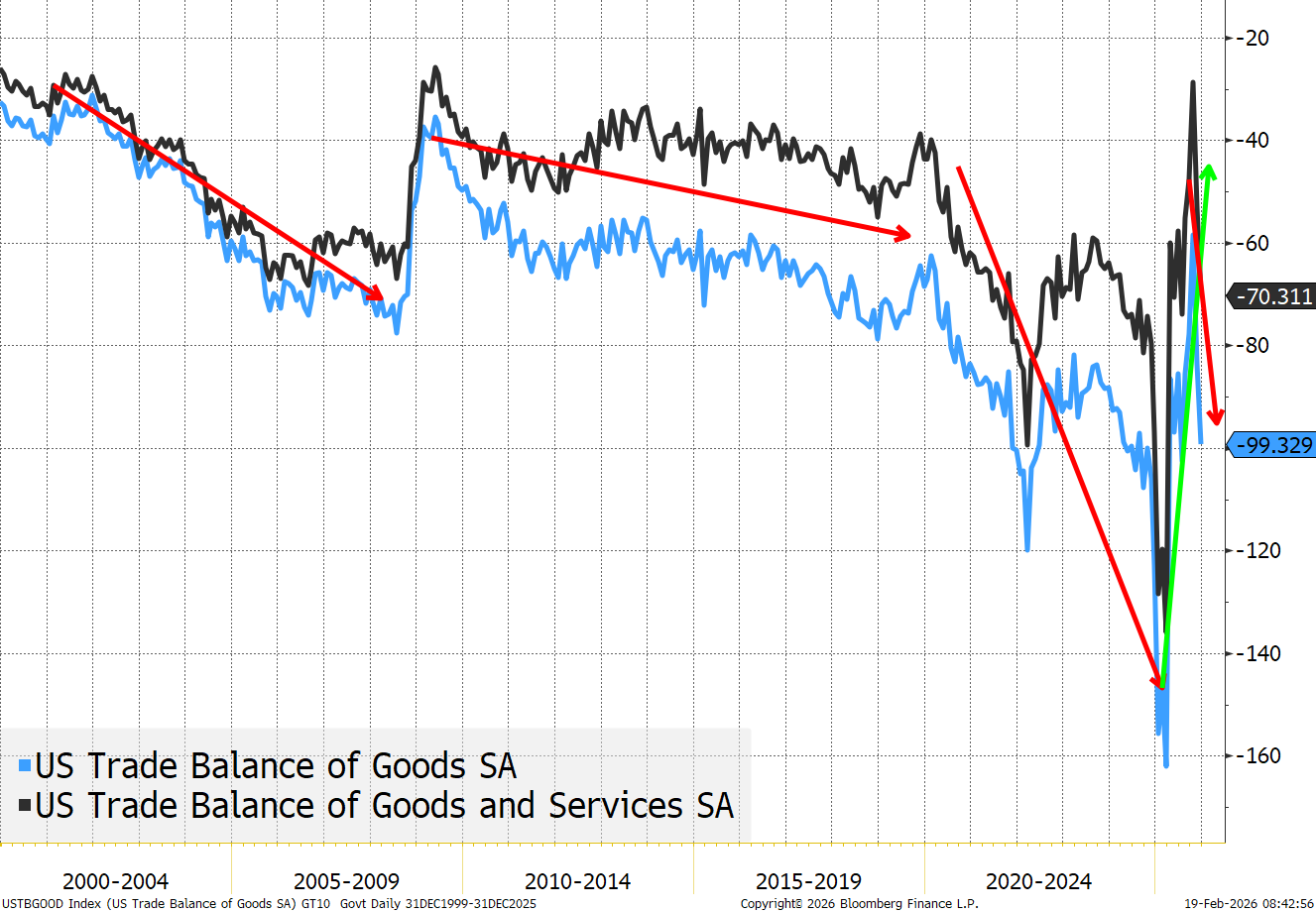
There are three things worth pointing out:
Trade deficits have existed this entire century. Trade deficits have been with us for some time but clearly grew during the early 2000s (the rise of China). They abated after the Great Financial Crisis (presumably less spending). Trade deficits actually got slightly worse during Trump 1.0 and got a lot worse under Biden (though the Covid pandemic played a role here, too).
There is some level of volatility on a monthly basis and annual basis.
The trade balance on Goods only is worse than Goods and Services. The U.S. exports services to the globe. We have argued since day one that there has been too much of a focus on trade balances of goods (that may be changing, but the administration was very clearly focused on goods, not the totality of trade).
I suspect if we had a “profitability”-based trade calculation, it would look a lot better for the U.S. (the U.S. imports low-profit margin stuff and sells high-profit margin stuff). That is clearly the case with services, and likely the case on goods too.
Services Surpluses and the Nasdaq 100
Not the greatest chart in the world, but interesting. As it shows trade surpluses in Services and some hint of correlation between service exports and the stock market. Check it out:
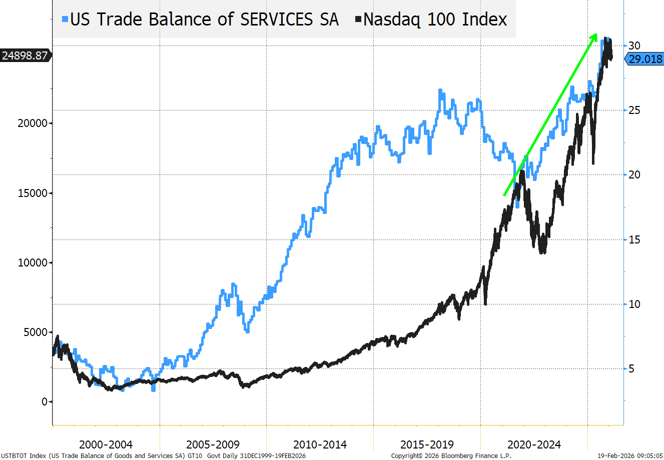
Service exports (presumably the cloud, data centers, AI, online meetings, etc.) have surged since Covid and the Nasdaq 100 has followed suit. I only mention this as we discussed France directing French government agencies to use only European software/data providers starting in 2027 (A Bridge Too Far?). While I’m not sure what can be done about it, there was a great deal of angst expressed during European meetings earlier this week, about the lack of a strong European competitor in the AI and large language model field at the moment. Policies that encourage Europe to focus on that, may be detrimental to U.S. stocks (and service exports over time). Not sure that is realistic, but something that hit our radar screen.
The 78% Decline Is True (kind of)
Note that the comment sections that I referred to earlier, had an incredibly Orwellian feel (especially the lack of any evidence by either side), but it is what compelled me to pull this together (conveniently on the day we release the data for December.
We often talk about how there are three kinds of lies: lies, damned lies, and statistics.
We try and avoid misleading (such as by using different time frames for different charts to hide or exaggerate things, using different scales, and so one). Having said that, it probably happens from time to time, as constructing and supporting a compelling narrative doesn’t always exactly fit the data seamlessly (otherwise it probably wouldn’t be a compelling narrative, it would be a “given”).
Now let's look at another chart of the trade balance, only more recent:
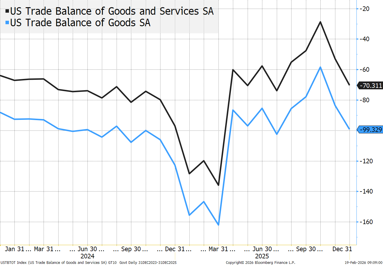
We went with a different time horizon here (see point above), because it makes the following things easier to see.
The 78% decline in trade deficit calculation:
The worst month for the goods and services balance was March 31 2025 (just ahead of Liberation Day and in the “heat” of the ramp-up on tariff rhetoric and actual tariffs (Fentanyl-linked ones for example)). The Trade deficit in March 2025 was -$136 billion.
The best month was October 2025 at -$29 billion.
The reduction was $107 billion. The change divided by the total is 78% ($107/$136).
That is the 78% calculation.
If this “methodology” were applied to the goods trade balance (which did seem to be the focus until recently, and that change to really include services in the admin’s thinking is positive) there is a 64% reduction.
The improvement and overall level in October is one of the best in years. That is a fact.
But the “methodology” makes zero sense.
The months leading up to Liberation Day were some of the worst trade deficits ever seen as companies ordered in goods to get ahead of the tariffs. Those months were worse, in direct response to moves by companies to mitigate the tariff impacts they would feel.
To a lesser extent, October is typically at the lower end of the range annually (presumably something to do with when items are purchased for the holiday sales season?)
In the last nine months (excluding the three months leading up to Liberation Day) the cumulative deficit is 517 billion. On a “straight” average, that would give an “annualized” trade deficit of $690 billion. I was going to argue that we could use the really good month of $29 billion (especially if we are going to positive) for the annualization, but with November and December both “reverting” that seems like a stretch.
The same nine months (April until December) had a $704 billion deficit. So on 9 month vs 9 month there is substantial improvement (but did the “front running” reduce imports later in the year?
For the full 2024 vs 2025 comparison it is $901 billion vs. $967 billion. Or a 6.8% decline (not bad, but not 78%). If we go to goods only, decline is only 4.8%.
I guess how you could have looked at the chart, from March 2024 to October 2025 and done a “trend line” showing that we were heading for positive months, but that certainly doesn’t look likely after November and December data.
We are now approaching the one year mark on tariffs and almost non-stop negotiations with countries on tariffs and trade. We have not yet seen whether the “bridge too far” (which focused on Greenland and the Gordie Howe bridge) will impact trade, as it is too recent.
Trade and tariffs and re-shoring and even ProSec were always going to take years to play out. We are seeing some positives, but there are risks to the strategy, and I think those risks have increased in the past month (despite some wild successes like Venezuela).
I remain cautious on risk here.
It is “mildly” strange that I’m a bit nervous sending this piece out, despite I that it is both objective and tied to facts (other than maybe my perception on bitcoin in my twitter feed – which could just be a vibe, rather than fact).
At the time of publication, Tchir had no position in any security mentioned.
