Perception and Reality Diverge in the 'Volatile' Treasury Market
While the narrative says one thing, the data might be saying something quite different. In the end, money always goes where it is treated the best.
You've reached your free article limit
You've read 0 of 1 free Pro articles.
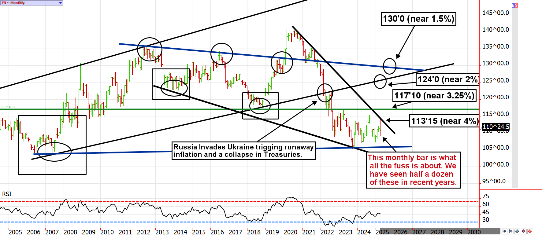
The 10-year note soared from about 1% in mid-2021 to 4.3% in October 2022, and despite some ups and downs, it is EXACTLY where it was after that historic yield rally (plunge in price). Yet, we let a few days of dysfunction alter our mindsets. We shouldn't.
Treasury market volatility is near its historical comfort zone. Additionally, despite all the problems the U.S. Treasury faces, it remains the least dirty shirt in the hamper.
Now that the world has liquidated its duration Treasuries due to a political boycott, to avoid the financial strain of refinancing U.S. short-term debt at much higher rates, or simply distrust of U.S. financial stability, where will the money go? Once the dust settles, investors onshore and offshore might look at their holdings and realize the grass wasn’t greener on the other side.
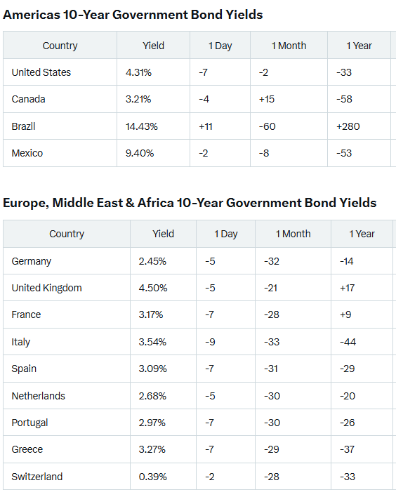
Narratives and emotions aside, U.S. Treasuries are paying a much higher yield than other developed nations with similar default risks. For example, the German 10-year (Bund) is paying 2.45%, Canada is paying 3.21%, and France is just over 3%. Yet, since the pandemic, monetary and political policy mistakes were made globally; it wasn’t just an in-house phenomenon.
It is difficult to compare the inflation rates of various economies because of different measurement methods; it is akin to the apples and oranges argument. Nevertheless, the stated U.S. inflation rate can’t be used to explain the yield difference. Of course, you could argue that inflation expectations due to tariffs are the culprit, but that is an academic exercise until it shows up in the data.
The U.S. inflation rate is 2.4%, Germany is 2.2%, Canada is 2.3%, and France is 0.8%. In other words, the U.S. is paying roughly 200 basis points above and beyond its inflation rate, whereas many others are paying 100 or less. France, however, is paying a premium over inflation similar to that of to U.S. debt.
In addition to inflation and political worries diverting safe-haven buyers away from the 10-year note or 30-year bond into sovereign debt assets, a significant amount of money is making its way into assets that are only safe havens and risk diversifiers until they aren’t (gold and cryptocurrency). In time, such decisions made in haste might be quite dangerous.
Holding cash (savings and money market accounts) isn’t a viable solution for larger amounts of capital due to the limits on deposit insurance. Eventually, the money will need to find a home. What if TINA (There is no Alternative) now means something different than it has in the past?
Perhaps, as time goes on, investors will realize the U.S. 10-year note and 30-year bond are the only game in town for risk-averse allocations. In other words, despite consensus thinking, there might not be an alternative to U.S. Treasuries. In the end, money always goes where it is treated the best.
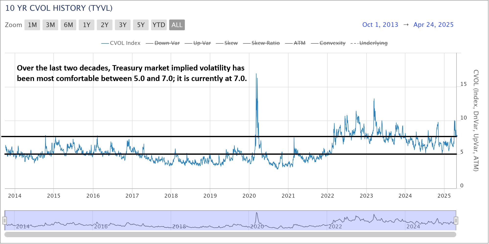
10-Year Note Futures CVOL (Implied Volatility)
For context, there were a few days of somewhat unusually high volatility in the 10-year note, but in the end, the market landed right where it started. Nevertheless, the headlines claiming bond market dysfunction have persisted.
Looking at the last 20 years of Treasury market volatility as measured by the CVOL index calculated by the CME Group (like the CBOE’s VIX used to measure stock market volatility), we can see the recent spike in volatility wasn’t unheard of. Looking back, it was a less concerning spike in volatility that we have seen since 2022, roughly a dozen times.
Additionally, the 10-year note CVOL has been quite comfortable between 5.0 and 7.0 for much of the last 20 years, and we are currently near 7.0. For perspective, any time the S&P 500’s VIX falls near 10.0, we consider it to be an extremely low volatility environment.
Thus, while the narrative says one thing, the data might be saying something quite different.
10-Year Note Futures Charts
We recently shared the monthly 10-year note futures chart, but we couldn’t leave it out of this discussion. When we digest information, it is important to remember context and history. April triggered some nerves in the Treasury market, but it is on pace to settle mostly unchanged.
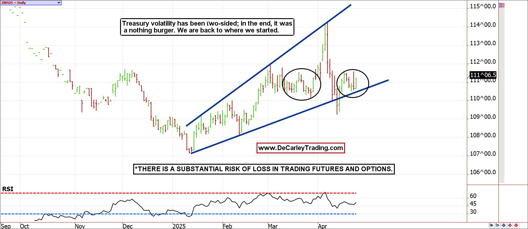
A closer look at the daily chart reveals a market that struggled with price discovery for a few days but landed right where it started. Further, the highs and lows were relatively contained by a reasonable trading channel.
Had it taken two weeks, rather than one week, to make the round trip, nobody would have blinked an eye. While there are advantages to technology and 24-hour markets, the drawback is quicker moves that can occur while we (are trying to) sleep.
In my eyes, an objective analysis of this chart doesn’t scream panic. If anything, it might be whispering opportunity.
Bottom Line
Prices are always temporary. Remember to look at the bigger picture before making sweeping changes to your trading or investing strategies. What feels true and apparent today might contradict the reality that a weekly or monthly chart is trying to tell us.
