People Love to Hate the Dow—But Its Latest Move Deserves Attention
Critics call it outdated and price‑weighted, yet the Dow just flashed an important technical signal. Here's a look at what’s shifting beneath the surface.
You've reached your free article limit
You've read 0 of 1 free Pro articles.
 Stock Markets Open Monday Morning After Dow Neared Record High Friday
The Dow Jones Industrial Index is an ancient index that everyone seems to hate. It’s price weighted, they cry. It doesn’t reflect today’s economy (by which I believe they think it doesn’t have enough growth stocks), but somehow or another it marches on.
I like the Dow because I think it actually represents a variety of industries and while it is pushed around by those high-priced stocks like Caterpillar and Goldman Sachs, do you think the S&P is any different as it is pushed around by a handful of stocks. And don’t be snobbish by saying at least those S&P stock pushers are doing it because of their market cap.
Let’s take a look at the chart of the Dow, though, because it is so different than the S&P’s chart. The S&P has been going sideways since October. You have to have been living under a rock not to know that by now. But the Dow, up until early February, was in an uptrend.
More than that, though, the Dow had been in an upward channel since last summer. Each time it tagged the upper bound, it corrected, and vice versa with the lower bound. In the markets I grew up in, this was how a chart moved in an uptrend—with corrections along the way. So when I complain about the relentlessness of the S&P or Nasdaq, that’s what I am referring to: they don’t ebb and flow the way the Dow does; they grind higher or lower relentlessly.
But back to the Dow. It fell out of the channel in early March. I gave it a chance to recapture that lower line, but it could not. Now the Dow finds itself at the same price it was in October as well; it just took a different trip there than the S&P did.
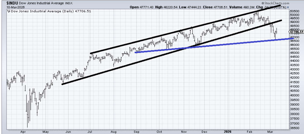
I am certain some will ask if this is now a bearish chart. Well, it doesn’t really have a top—not yet, at least. That blue flattish line feels more important to me than the black channel line. It’s easy to break a steep uptrend line; it is not that easy to break a flatter line (look how hard it was to break 6800 on the S&P and now 6700).
So that’s the line on the chart I care about now: the blue one.
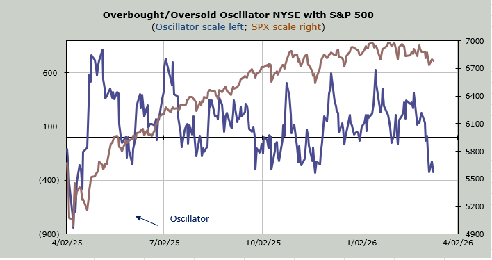
I also care that the indicators have barely changed in days. I care that the NYSE has now had four red breadth days in a row. I care that in the last eight trading days, net breadth on the NYSE has been red for six of them. The more red breadth days we collect, the closer we can get to a good oversold condition.
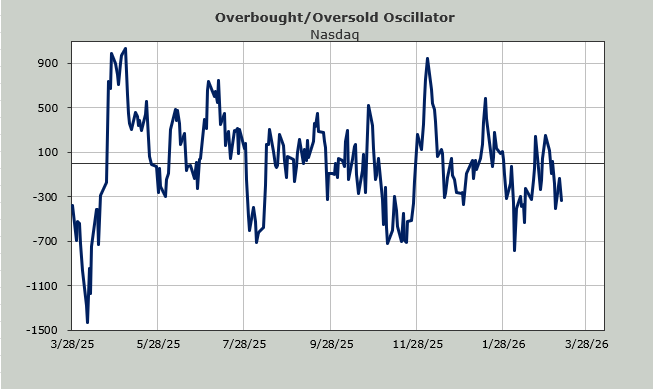
Finally, I also care that the growth stocks have been outperforming the 493 (the DJIA tends to move with the 493, so here’s another reason to watch it!). Nasdaq has clocked in two straight green days. It hasn’t managed to string together three straight green days since January. So, I care because I want to see if it can change that pattern.
