Have You Heard the BUZZ? Here's What It Could Mean for the Stock Market
An ETF goes parabolic, the Mag 7 and a potential change in leadership.
You've reached your free article limit
You've read 0 of 1 free Pro articles.
If I guaranteed you that the S&P 500 would rally 100 points from midday Wednesday to midday Thursday, would your immediate reaction, if you couldn’t buy an ETF but had to buy an individual stock, be to buy one of the Magnificent Seven (which is no longer seven, but that’s a story for a different day)?
Here’s the (sort of) list of Mag 7 names: Netflix NFLX, Meta META, Google GOOGL, Apple AAPL, Nvidia NVDA, Microsoft MSFT and Tesla TSLA.
Four of the seven were either flat or down while the S&P tacked on that one hundred points. So we’re in a place where the former faves have done well but are not the go-to’s they were for the last number of years.
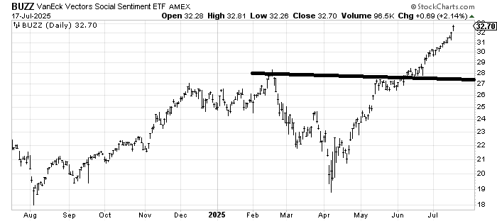
With that in mind, I saw a chart of the ETF BUZZ (VanEck Social Sentiment ETF) in BTIG Chief Market Technican Jonathan Krinsky’s excellent missive Thursday. Wowee. That is some move since June and now it has begun to go parabolic.
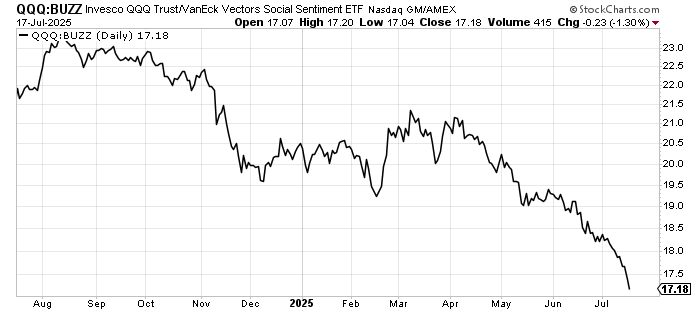
Naturally this took me to the ratio of the QQQs to BUZZ and here’s another wow: Look at how poorly the QQQs have done relative to BUZZ since April. Think about this, we consider the QQQs to be the pinnacle of technology stocks, yet they practically look like the healthcare stocks relative to the S&P when compared to BUZZ.
So what is in BUZZ? The top five holdings are: Rocket Lab RKLB, Coinbase COIN, SoFi SOFI, AST SpaceMobile ASTS, and Robinhood HOOD. Don’t worry, Beloved Nvidia is in there too, but NVDA and Palantir PLTR are numbers ten and eleven! You know what else struck me? There is not one AI name in the top-five holdings.
I was taught that corrections are the market’s way of changing leadership. Was the spring plunge the market’s way of changing leadership? Or is this just speculation run amok?
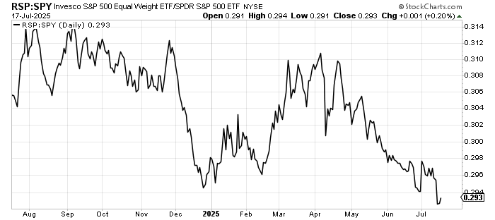
If you go back to that ratio chart, it’s a trend that has been in place for at least a year, hasn’t it? While it’s not the same chart, it is quite similar to the ratio of the RSP (equal weight S&P) to the S&P itself: a downtrend for a year.
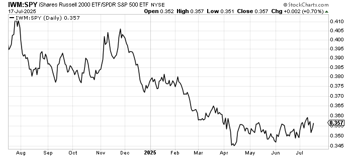
But you know what chart doesn’t have that shape? IWM (small-caps) relative to the S&P. We see the plunge in December. But this ratio made a low in April. It’s not made another low since then; it’s basically saying the IWM and the S&P have been in balance.
We’ll see what earnings season brings for the Mag 7 or whatever their number is now, but if they don’t soar we’ll have to wonder if they have now become ordinary stocks. Now that would be a change, wouldn’t it?