A Review of the Intermediate-Term Indicators
Let's zoom out and get a view of the bigger picture as we head into Fed Day.
You've reached your free article limit
You've read 0 of 1 free Pro articles.
Fed Day. It’s finally here. Will we get that much-talked-about Hawkish Cut? I certainly don’t know. I don’t even know if the market will like it or not like it. I just know that bonds are getting oversold in the near term. I estimate sometime between Wednesday and Friday.
Away from that, I have been asked to do a review of the intermediate-term indicators. One of the reasons I haven’t done so in quite some time is because they have mostly flat-lined for the last few months.
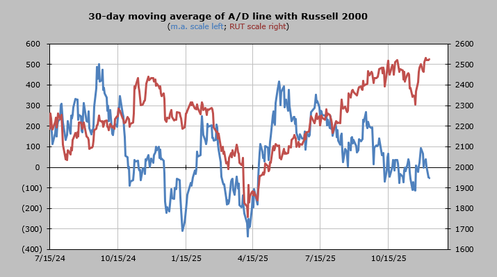
Having gotten overbought in mid-September, the 30-day moving average of the advance/decline line was on a steady move toward oversold until just prior to Thanksgiving. But one thing you can see is that the chart typically oscillates, meaning it goes up and down, from big minus readings (oversold) to big positive readings (overbought), but since that overbought peak in mid-September, it has been a grind.
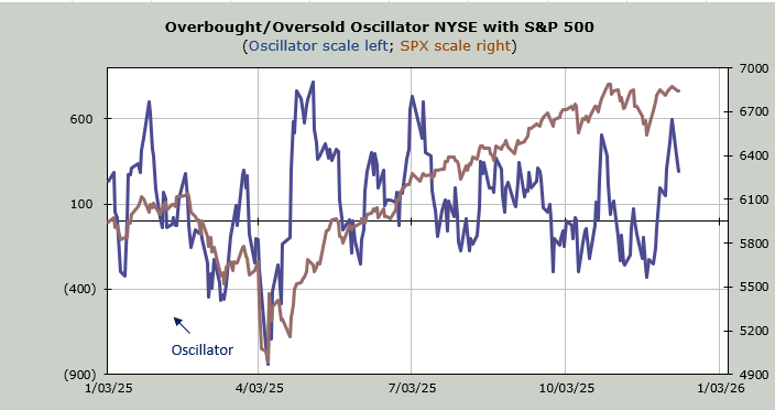
We did bounce, but as I noted at the time, the math behind the oversold reading wasn’t long-lasting. To get a good oversold (intermediate-term) reading, we need a market that is persistent on the downside for weeks, not just a week here or there, and mostly what we had from September was a week here or there. Then we got that mid-November plunge, but it didn’t give us the time factor (it was not persistent for weeks), thus the oversold reading gets used up quickly.
It has been trading back and forth over the zero line for two months now. It has slipped back under the zero line, so I do expect it to rise again late this week.
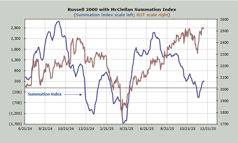
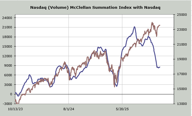
Yesterday, we looked at the McClellan Summation Index, and I noted that the cushion (what it will take to halt the rise) is small. It remains small. A net differential of -400 advancers minus decliners on the NYSE would halt this rise. Prior to this recent turn, the persistence was to the downside since July.
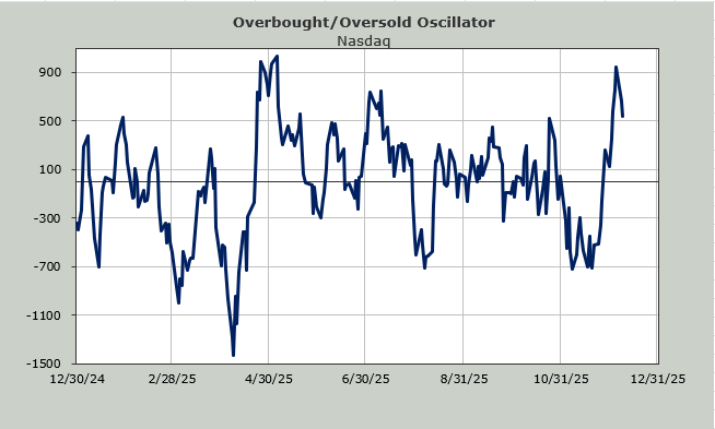
Nasdaq is a bit different. It, too, peaked in July, and then it headed south in a major way in mid-October, making that late October high a divergence. It has not joined the upside during this entire rally. Yet squint hard, and you can see that it finally stopped going down. Here I use volume, so if net volume on Nasdaq comes in at -800 million or worse, this will turn right back down again. Quite frankly, considering that net volume on Nasdaq has been positive for 10 of the last 12 trading days, I am very surprised this hasn’t turned upward yet.
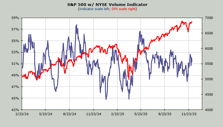
The Volume Indicator looks very similar to the 30-day moving average of the a/d. It has hovered back and forth over the 50% line since July. You can see the oversold reading (48%) just before Thanksgiving, but it’s not been very dynamic, and it sits at 51% as of this writing.
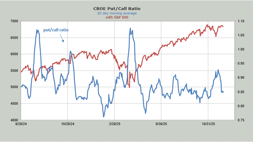
The ten-day moving average of the put/call ratio sits at .85. It’s no longer showing too giddy (as it did in late September when it got to .81. It is no longer showing fear as it did when it got to .93 just before Thanksgiving. Here, too, I would call this just complacent, not giddy.
I could probably show you some other indicators, but you get the picture: there is a lot of churn and chop going on. Step back and look at so many charts over the last few months: they mirror this action of up-down-up-down. But mostly the moves are minor, which is why I have focused on the short-term, because at least those indicators have moved.